 English
  Deutsch
  Español
  Italiano
  Български
  简体中文
简体中文  Polski
  Nederlands
  Dansk
Dansk  Svenska
  Français
  Português
  Ελληνικά
  Català
  Română
  Suomi
Suomi  Čeština
  Magyar
development
Building Charts That Work for Everyone
Data visualizations are one of the hardest accessibility challenges on the web. Here's how to make charts genuinely usable for people with disabilities.
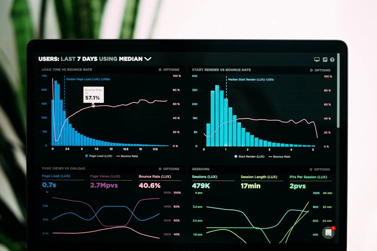
The chart problem
Charts and graphs are inherently visual objects. They encode information through shape, position, and color — three channels that are either meaningless or distorted for a significant portion of your audience.
Around 8% of men have some form of color vision deficiency. Screen reader users receive no meaningful information from an SVG bar chart unless the developer has explicitly provided it. And keyboard users often find interactive charts completely unreachable.
The result: data visualization is probably the area of web design where the gap between what sighted users experience and what everyone else experiences is widest. And it’s a gap that organizations rarely notice, because accessibility audits focus on forms and navigation before they get to the charts on the reports page.
This guide covers what accessible data visualization actually requires — not a checklist, but an understanding of why charts fail and what to do about it.
Why charts are particularly difficult
Most HTML elements have a native role, name, and state that assistive technology understands. A <button> is a button. A <table> is a table with rows and columns. A form input has a label.
A chart rendered as SVG or canvas has none of this. It’s a drawing. Screen readers see an image (if you’re lucky) or nothing at all. The developer has to reconstruct the semantic layer from scratch.
At the same time, charts are often the most important content on a page. A bar chart showing monthly revenue, a line graph tracking user growth, a pie chart breaking down category distribution — these are often why the user is on the page. Excluding them from a significant portion of visitors is a serious problem, not a minor inconvenience.
The color problem: never rely on color alone
The most common chart accessibility failure is using color as the only way to distinguish data series or categories.
A line chart with four lines distinguished only by color — red, blue, green, orange — is unreadable for many users with color vision deficiency, and completely meaningless to anyone using a high-contrast mode or a grayscale display.
The fix is redundant encoding: use color plus at least one other visual property.
- Line charts: use different dash patterns alongside colors (solid, dashed, dotted, dash-dot)
- Bar charts: use textures or patterns alongside colors, or add data labels directly on bars
- Scatter plots: use different marker shapes (circle, square, triangle, diamond) alongside colors
- Pie charts: add text labels inside or adjacent to each slice — never rely on a legend alone
This falls under WCAG 2.2 1.4.1 Use of Color (Level A): color must not be the sole means of conveying information.
Contrast for charts
Non-text visual elements like chart bars, line strokes, and data points must meet 3:1 contrast against their background under 1.4.11 Non-text Contrast (Level AA). Test your chart palette with a contrast checker — many brand palettes that look fine in large areas fail this requirement at smaller sizes.
Text within charts — axis labels, data labels, legends — must meet the same contrast requirements as body text: 4.5:1 for normal text, 3:1 for large text under 1.4.3 Contrast Minimum.
Providing text alternatives
Every chart needs a text alternative that conveys the data it displays. Exactly what form this takes depends on how complex the data is.
Simple charts: descriptive alt text
For a bar chart showing five values, a well-written alt attribute can summarize the key finding:
<img
  src="monthly-revenue.png"
  alt="Monthly revenue Q1 2025: Jan £42k, Feb £38k, Mar £51k,
       Apr £49k, May £56k. Steady upward trend from February onwards."
>
The alt text here does two things: it states the data points and summarizes the key insight. Don’t just describe the chart visually (“a bar chart showing revenue”). Describe what the chart communicates.
Complex charts: supplementary data tables
When a chart contains more data than fits in an alt attribute, provide an accessible data table nearby. This also serves people who prefer tabular data to visual formats. The table can be hidden by default but reachable:
<figure>
  <figcaption>Revenue by region, Q1 2025</figcaption>
  <svg aria-labelledby="chart-title" aria-describedby="chart-desc" role="img">
    <title id="chart-title">Revenue by region, Q1 2025</title>
    <desc id="chart-desc">Bar chart showing UK leading with £180k,
    followed by DE at £124k, FR at £98k, and NL at £71k.</desc>
    <!-- chart content -->
  </svg>
  <details>
    <summary>View as table</summary>
    <table>
      <caption>Revenue by region, Q1 2025</caption>
      <thead><tr><th>Region</th><th>Revenue</th></tr></thead>
      <tbody>
        <tr><td>UK</td><td>£180,000</td></tr>
        <tr><td>DE</td><td>£124,000</td></tr>
        <tr><td>FR</td><td>£98,000</td></tr>
        <tr><td>NL</td><td>£71,000</td></tr>
      </tbody>
    </table>
  </details>
</figure>
SVG-specific patterns
SVG charts rendered inline (rather than as image files) can be made directly accessible using ARIA. Key patterns:
- Add
role="img"to the<svg>element - Provide a
<title>as the first child of<svg>and link it witharia-labelledby - Add a
<desc>for longer descriptions and link it witharia-describedby - Mark decorative elements (grid lines, tick marks) with
aria-hidden="true"to reduce noise
For interactive charts where users can select data points, each interactive element needs a proper role, name, and keyboard support.
Keyboard navigation for interactive charts
If your charts are interactive — hover tooltips, clickable segments, brushing and zooming — they must be fully keyboard operable under 2.1.1 Keyboard (Level A).
For charts with many data points, implement a roving tabindex pattern: only one element in the chart is in the tab sequence at a time, and arrow keys move between data points within the chart.
<!-- Each bar is a button, navigable with arrow keys -->
<g role="group" aria-label="Monthly revenue bars">
  <rect
    role="button"
    tabindex="0"
    aria-label="January: £42,000"
    onkeydown="handleChartKey(event)"
    ...
  />
</g>
Tooltips that only appear on hover must also appear on keyboard focus. A tooltip visible only to mouse users is an accessibility failure.
Choosing the right chart type
Some chart types are inherently more accessible than others. When you have a choice:
| Chart type | Accessibility | Notes |
|---|---|---|
| Bar chart | High | Quantities easy to encode with labels; good keyboard support possible |
| Line chart | High | Use different dash patterns; annotate key points |
| Table | Highest | Easiest to make accessible; often the right choice for data |
| Scatter plot | Medium | Needs careful marker differentiation; keyboard navigation complex |
| Heatmap | Low | Color-dependent by nature; always provide a table alternative |
| Pie/donut | Low | Hard to compare values; avoid for more than 3-4 segments |
When in doubt, a well-formatted table is almost always more accessible than a chart — and often easier to read regardless of disability. Don’t use a chart because it looks modern; use it when it genuinely helps users understand a trend or comparison faster than tabular data would.
Testing your charts
Automated accessibility scanners can check for missing alt attributes and some ARIA patterns, but they cannot verify that chart data is meaningful, that keyboard navigation works correctly, or that the chart makes sense to a screen reader user. Test with:
- A screen reader (NVDA + Firefox, JAWS + Chrome, VoiceOver + Safari): navigate to the chart and verify what gets announced
- Keyboard only: tab to the chart and confirm all interactive elements are reachable and operable with keyboard
- Color blindness simulation: use Chrome DevTools (Rendering > Emulate vision deficiency) to see how the chart appears under different types of color vision deficiency
- Zoom to 200%: verify labels and legends don’t overlap or get cut off
Our screen reader evaluation service tests charts with real users of assistive technology — the fastest way to find out what your users actually experience.
Test how your data visualizations hold up